The internet has been a huge part of our lives for years now. And, as if by magic, the number of websites and apps available on the web keeps growing. we’ll look at some inspiring UI designs that have nailed the internet (and how). The designers who create these sites and apps must be feeling extremely proud of how effective their designs are because they work so well at attracting their audience’s attention. The internet is a vast and overwhelming place. There are so many websites, apps, and services with so many different features that it can be difficult to find what you’re looking for. That’s where inspiration comes in: It’s a way of getting ideas for your next design project by looking at other people’s work. In this post,
As said, we’ll look at some inspiring UI designs that have nailed the internet (and how).
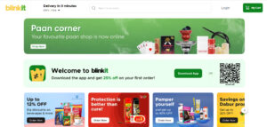
Blinkit is a website that sells groceries. It has an appealing UI design and it’s very simple to use, making it easy for people to find what they need.
In this example, Blinkit UI design is great because it looks clean and professional while still being user-friendly. The homepage has big images with bright colors on the left side of the screen, which makes it easy to navigate through while also showing off some of Blinkit products at the bottom of the page (which are featured above). On top of that, there are no ads or other distracting content up top; instead, everything comes together nicely!
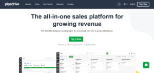
Pipedrive is a sales CRM that’s been around since 2012. It has a clean and minimalist design and it uses color well to help the user understand what they’re looking at. The typography helps with this, too—it’s very legible, which makes it easier to navigate the site (and if you’re going through something like this process by yourself, it can be pretty intimidating).
It’s also a good example of how UI design has changed over time: while Pipedrive looks like an old design on the surface, underneath all those pixels lie some pretty sophisticated technology behind them!
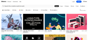
Adobe Behance is a portfolio website for creatives. It’s designed to help you showcase your work and connect with potential clients, collaborators, and partners. The site has a clean, minimalist design that makes it easy to navigate and find the information you need on any page of the site.
The homepage features large images of each member’s portfolio that can be enlarged by clicking on them (similar to Facebook). The navigation bar at the top allows users to move between pages by clicking on links or icons within each image; this makes it very easy for people who are unfamiliar with Adobe Behance
e’s layout or interface language because they don’t have any trouble figuring out where they need to go next after seeing how everything looks laid out before them!
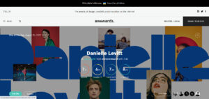
Awwwards is a website that awards websites, apps, and other digital products for their design and user experience. The site was founded in 2006 by three French designers as a way to celebrate the best design on the web. Awwwards has a variety of information on their sites like industry news and their top website awards. Awwwards also features categories for different types of design and industry trends like mobile apps, user interfaces (UI), web applications, etc., making it easy to find something relevant to your needs! Their UI itself was designed with an attractive theme so you can easily navigate through all these categories without getting lost or confused about what you’re looking at the
the first time around; this helps make sure everyone knows where they’re going when they come here again later down the road.”
JackThreads is a clothing store that offers daily deals on clothes, shoes and accessories. The company’s website is very clean and simple with bright colors that appeal to the eye. The design of their site isn’t over complicated like others might be which makes it easy to use while still being appealing enough so as not to get boring after a while. The navigation bar at the top of each page has been simplified into two buttons: the “Shop Now” button and the “Sign up Now” button (we will discuss how this works later). Google Play Music Google Play Music is a great example of a UI design that has nailed the internet. Google Play Music is one of the most popular music streaming services in the world and it’s
known for its slick design. In fact, many people use their service because they love how easy it is to find music through their interface — even if they don’t know much about technology or software development, they can tell you whether or not your app works well just by looking at its look and feel.
UI designers have been using this concept since the beginning: making sure that whatever you’re creating looks great on both desktop computers (Windows 7/8/10) as well as mobile devices like iPhones or Android phones/tablets (iOS 11). This makes sense because most people who visit websites today will likely do so on either PC or mobile device; therefore having good looks across all platforms helps ensure that everyone gets what they want out of an experience online — including those who may not understand what design languages are all about!
These UI designs have effectively used their appealing design to make the consumers on their site or app happy. A good design is important for every business. The design should be appealing to the consumer and make them happy. It should be easy to use, navigate and understand. If a user finds it difficult to use your website or app then there is a problem with your usability of course! When you’re looking for a new UI design to use in your project, it’s important to remember that the goal is not only to make people happy and get them off your site or app but also to appeal to their emotions. The best way to do this is by giving them something that they need—and then making sure they can find it easily.
