Believe us or not, the very first thing that grabs our attention is the logo design. The logo itself speaks the loudest It’s also the central icon that imprints on people and how they will remember you, not only this but, how they make associations about your brand While it’s nice to let your imagination run wild while developing a logo, there are a few frequent errors that can undermine an otherwise excellent design. Luckily, small errors are pretty easy to rectify if we are aware of what we’re doing.
We’ve mentioned the top logo design mistakes in the categories they most commonly appear:
Color, Shapes & Symbols, Typography.
LET’S GET INTO IT!
1) COLOR
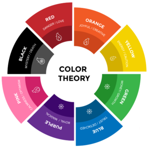
logos are for distinguishing your business. Many times we have seen so many brands making this huge mistake of copying the color scheme instead of making their own. For example, if the brand is related to eco-friendly products, then they are making the logo “GREEN”. Which isn’t compulsory. Colors are intrinsically linked to our emotions as signals to help us understand/identify as color speaks. Think of color as part of your brand’s personality. Keeping this in mind, your brand’s logo design needs to reflect your brand. One of the most critical logo design mistakes you can make is to use colors that don’t appear anywhere in your brand identity. At all costs, you
should avoid making this grave error. The common reason colors don’t work well together is that they have different values and saturations. Making a deep-Mauve work with a pastel blue is ‘EXTREMELY HARD’ to pull off. So the solution to this issue is to Pick logo design colors with similar saturation and value. It shows care for your design process and a commitment to consistency in your brand. Using too many colors can be a huge issue too. How? Let me tell you. using too many colors signifies that you can’t decide what palette to go with, which results in ‘UNCLEAR BRANDING’ and therefore less likely to resonate with your target audience.
2) LOGO MARKS
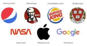
As a general guideline, consider if a container adds or deviates the attention of your brand. Try out many combinations until you find one that looks good. Having a HUGE brand mark with a teeny-tiny line of text is a typical error. Visual hierarchy is about designing with sight in mind, as we previously covered. This entails balancing the sizes of all the components of your logo design. Your chosen fonts should have a distinct relationship to one another that follows a logical and understandable design hierarchy. What is the first place the eye wants to go? What information do we get, and how is it presented to us? Is there a smooth transition between the primary typeface, secondary font, and logo mark? Even if it’s really basic, make sure the logo mark you select has some connection to the content.
3) FONTS
It’s necessary to decide on a font that matches your whole story and purpose. If you run an up-to-date tech company, for example, you’ll not need to own a cursive, elaborate, or old-style font. Similarly, ensure your font has enough distinction to be seen with ease. Insufficient weight or a scarcity of differentiation between your text and background color makes it tough for individuals to browse your logo design. The font must match the nature of the product or service you are offering. Modern fonts are a great place to start because of their flexibility and visibility in a variety of media. Explore different fonts until you find one that reflects your brand story. Logo subtypes should support the main type in a meaningful way. A common logo design mistake is the pairing of mismatched fonts. Use up to two fonts when designing your logo. Usually one is dominant and the other is not. The main font needs to describe the most memorable information such as the company name, and the secondary font is used to let people know what you are doing. Ultimately, people make mistakes in their logo because they don’t follow some basic principles. To avoid these mistakes, it’s a good idea to ask a few questions about the logo design from the viewer’s perspective.
Can you see the logo? Does it look good? Does it make sense visually? Do the colors match? Does the logo design match your brand identity? Does it work between media such as print, web, and social media? Design is the conceptual justification of all the decisions you make. You might want to add 10 shapes, 15 fonts, 3 containers, and all the colors to your logo, but that doesn’t give your customers the impression you’re in control. By learning the basics of logo design, you can effectively break the rules when you need them. Until then, keep things simple to avoid logo errors.
Disclaimer: We just wanted to let you know that the images we used are only for illustration purposes and may not be an exact representation of what our final product will be like. All images are copyrighted by their respective owners.
Related Articles
Justify Fonts Choices in Your Design
20 Best Graphic and UI Design Software for Designers in 2022 – (Free and Paid)
