If you dip a toe into the vast world of typography, you’ll probably find it a bit overwhelming. More than most other design elements, fonts convey both message and emotion to your viewers almost instantaneously, so choosing the right font is crucial. There are now thousands and thousands of fonts with various styles available with just one click. But it’s harder than ever to know if you’re choosing the right font for your project or component. Read on to learn how to make the right choice by understanding the different types of fonts and what type of project design is best for them.
Before we dive into the world of font types and font styles, it can be helpful to understand a few things about type anatomy. All fonts lie on an invisible plane called the baseline – think of it like the blue lines on your loose sheet of paper – and have an invisible centerline called the midline. Cap height is the top plane of a capital letter. The crossbar is the line in the center that cuts an H or A. For some letters, like the lowercase h or b, there’s what’s called an ascender, a line above the middle line. Others have a descending, you guessed it! drop below the baseline. Classic descending marks are small loops over a lowercase g or the bottom half of a y.
All typefaces have these basic elements, but their thickness (called “weight”), shape, and height all affect the “family” or type of font to which they belong…
Justify fonts choices:
SERIF FONTS:
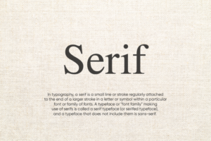
Serif fonts are the most classic and original fonts. They are named after the small feet at the beginning and end of the letters. Serifs originated with the Romans, who tossed the brushstrokes up and down, creating what we now call serifs. Serif typefaces became popular in the 15th century and remained on the market for three hundred years. Even within this single name, there are many smaller classifications (Classic, Classical, Neoclassical, Transitional, to a few). While a casual observer might lump them all together, a typographer can interpret that slight difference in actual weight, height, and wheelbase shape for your clue as to when it was created.
For the connoisseurs of typography, here’s what you need to know: serif fonts are ubiquitous in our daily lives in almost every book we read or document we open (hey, Times New Roman). These are the go-to tools for logos and prints and are often considered the most trusted (or conservative) fonts on the planet. Our eyes love them for everything from short headlines to long pages of text.
SLAB SERIF FONTS:-
serifs are the most impressive wide serif fonts. They are larger cousins of classic, quiet serifs, featured in 19th-century billboards, posters, and flyers, designed to convey their message from a safe distance. They then evolved into more distinctive forms such as the increasingly popular Clarendon, which can work for longer passages of text. Tiles almost always give a vintage vibe to a design and they have an undeniably sporty character. Classic shapes work extremely well for any outdoor-related brand, and sleeker modern versions always have a slightly artistic feel, perhaps because most All typewriter fonts are slab serifs.
SANS SERIF FONTS:-

Sans serifs are small serif fonts. They started appearing in the mid-19th century, but were successful in the so-called “modern” era, in the twenties and thirties. They were considered new and flashy, like the shorter skirts and the Charleston dance craze. (Fun fact: you’ll always see sans serifs with the word “odd” in their names because people think they’re rude and only good for the public.) By the mid-century, German designers ran away with bodiless sans serifs and created some typefaces that are still popular and iconic to this day, such as Futura and Helvetica. Sans serifs are still considered to be the most economical, efficient, and clean, not only but also, a modern choice. They are also readable in many sizes, and their less detailed shapes are perfect for digital displays. Sans serifs are bold and overbearing – while they work well for long pieces of text, they always shine in broader uses like headlines and logos. As noted above, sans serifs have exploded in popularity due to the growing importance of digital design. But regardless of the family, all fonts intended for digital use are modified to improve readability and on-screen performance in a variety of formats. This means less eye strain and fatigue for anyone working on your design. If you are a web designer, this is extremely important. On the other hand, many web fonts are designed specifically for websites to take full advantage of the unique design potential of digital interfaces and do not even include the corresponding desktop font. That’s why it’s essential to think carefully about your font choices if you’re considering moving from web design to print marketing material. Tips for combining font types.
Peanut butter and jelly. Internet and cats. Some things are meant to go together. The font is no different. A quick search will bring up tons of specific suggestions for combining different types of fonts, using easy-to-find fonts already on your computer, and fonts you might need to search for. A few general guidelines: As with all aspects of design, contrast is key. You can’t beat an uppercase sans serif and an italic serif. The lightness of italics balances the heaviness and darkness of sans. Sometimes it’s not even a combination of fonts from different families – most sans serif families have a wide range of weights and spacing, so a font can be used in many other ways. together in the same design. Condensed and heavy for titles, light, and even for body text. Never underestimate the versatility of just one font type.
Now that you know the different types of fonts, you can take your designs to the next level. And because the best advice is often the most gimmicky: have fun and experiment! Sometimes the combination of two fonts creates a layout that is more than the sum of its parts, and other times a font you never thought would work is the answer to all problems. your design. And don’t forget that even the most seasoned designers will try several font styles and font combinations before finding the right one. Familiarize yourself with the rules of font types so you can take risks and make your next type project shine!
